Generate 30 Days of Personalized SEO Blogs in 30 Seconds to Grow Organic Traffic
Buzzkit AI
Introduction
Buzzkit is an AI-powered platform that helps founders and small teams grow their online presence through consistent, high-quality blog content. It automates the entire SEO workflow by generating, optimizing, and scheduling 30 days of blog posts in just 30 seconds. Instead of spending hours on keyword research, writing, and formatting, users get ready-to-publish articles tailored to their business and audience. Built for speed and simplicity, Buzzkit removes the friction of content marketing so that small teams can stay focused on building their product.
Defining the Product Experience
My role was to design the product experience from the ground up. This included defining key user flows, building a reusable design system in Figma, and leading user research to understand how founders and marketers create content. The insights shaped features like tone customization, content scheduling, and a seamless generation workflow that turns SEO strategy into a 30-second task. Close collaboration with engineering and product teams ensured that every AI interaction felt both powerful and easy to use.
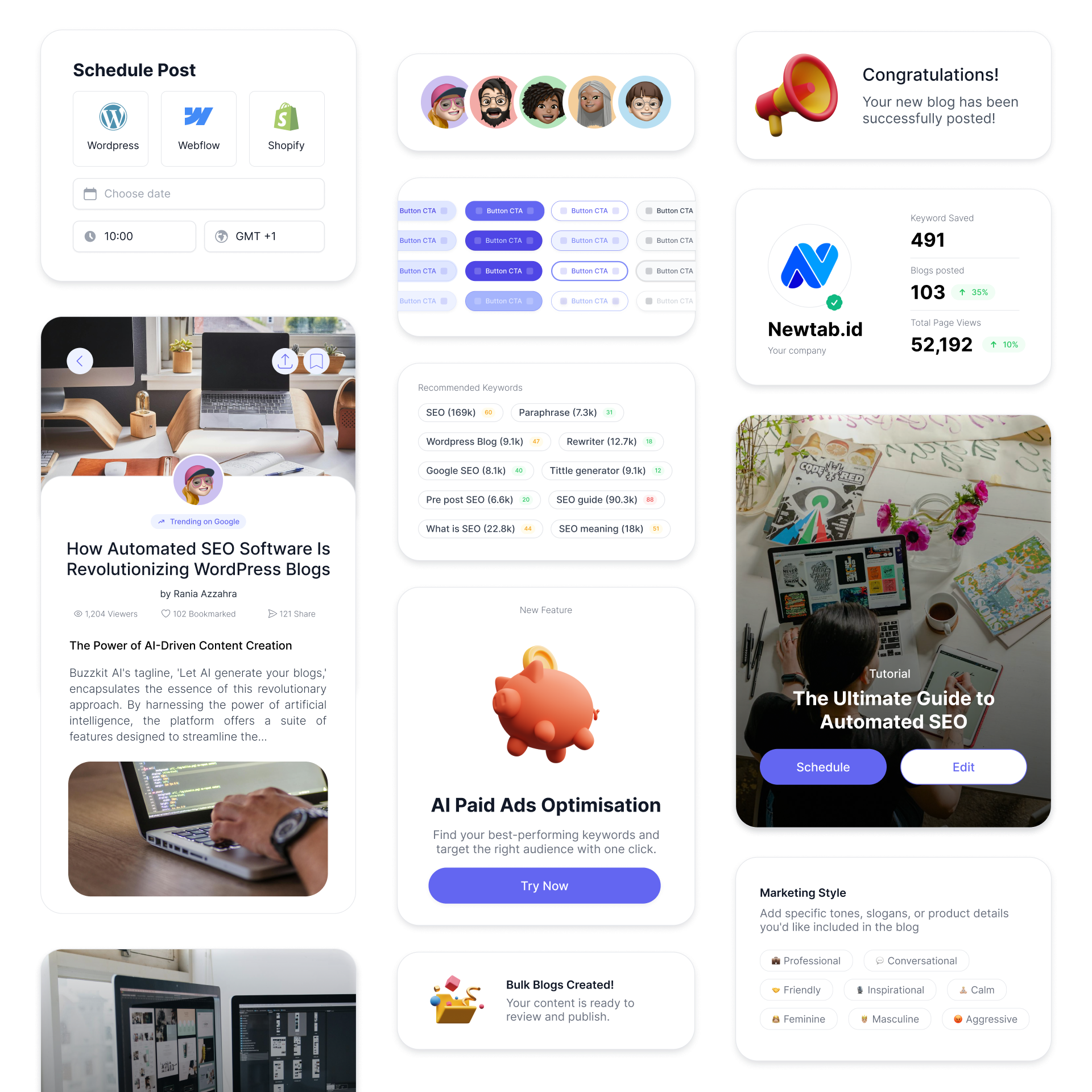
Design Snippets
Design System
To support a fast-moving team and ensure visual consistency across the platform, a design system was built from the ground up in Figma. The system includes a full set of reusable components, structured layout grids, and standardized typography and color tokens. Each element was documented with clear usage guidelines to speed up handoff and reduce design drift. The design system not only improved collaboration between design and engineering but also made it easier to scale new features without reinventing patterns.
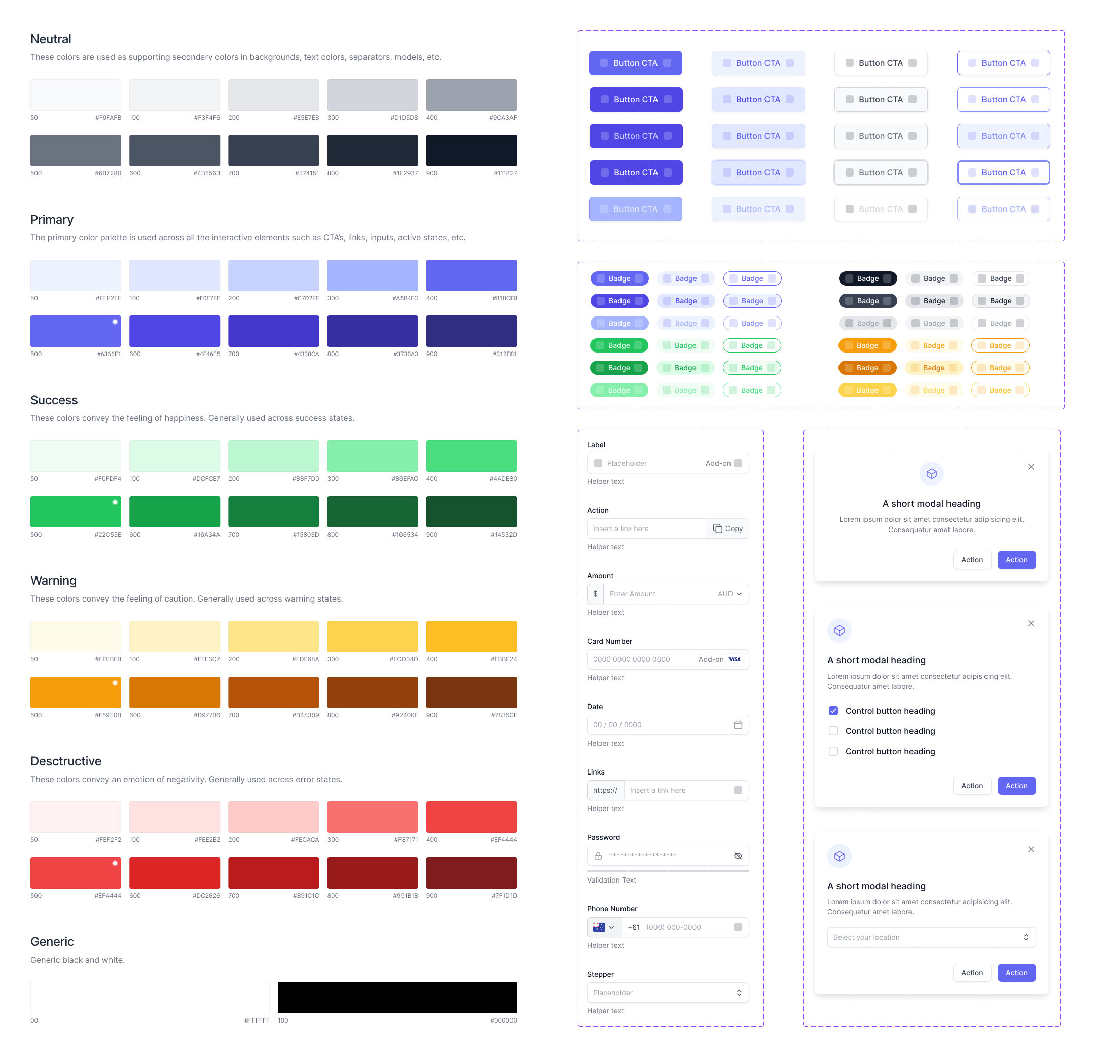
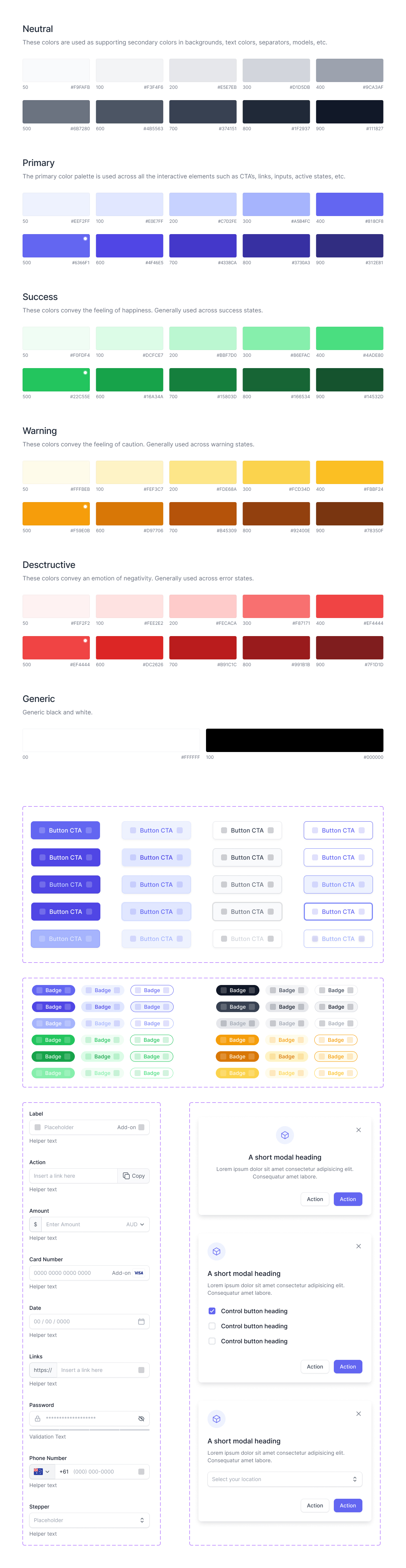
Buzzkit Design System
Summer Refresh
The Summer Refresh focused on giving Buzzkit a more polished and cohesive visual identity while improving usability across key screens. Spacing, typography, and color usage were refined to create a cleaner and more readable interface. Components were updated to feel lighter and more responsive, and edge cases across breakpoints were addressed for a smoother experience on all devices. The refresh wasn’t just visual, it also simplified core workflows to make content generation and scheduling feel faster and more focused.